
Have you experienced that awkward moment when your “new and improved” product sits beside the old one and looks like a distant cousin? I’ve seen it happen. As a graphic designer, I’ve learned that a rebrand isn’t about making things prettier. It’s about making your product easier to recognize, understand, and remember.
That’s where a full-service creative agency earns its keep: turning strategy into visuals people can spot before they read the label.
Olipop is a great case study. Its latest packaging refresh keeps the brand’s nostalgia but pushes it into a brighter, more expressive world. PRINT reports that design agency Collins used late-’60s and ‘70s influences, expressive icons, pop-art cues, bold type, and illustrated scenes. The goal was to make it “delicious” and “good for you” feel like they belong in the same can.
So, what can you learn from Olipop? Let’s take a closer look!
What to Learn From “The Feel Good Soda” Redesign?
Lesson #1: Give Nostalgia a Modern Job
Olipop doesn’t use retro design just because retro is trendy. The references reconnect soda with the fun, familiar feeling people already associate with the category. Balance matters. Too much nostalgia can look dated.
If you’re planning a rebrand, ask: What should customers remember about my product? Your branding and logo design in Santa Clara or San Francisco should bring that feeling forward, not bury it.
Lesson #2: Build A Visual System, Not One Pretty Package
One package can look fantastic. Then the second flavor arrives, and nobody knows they belong together.
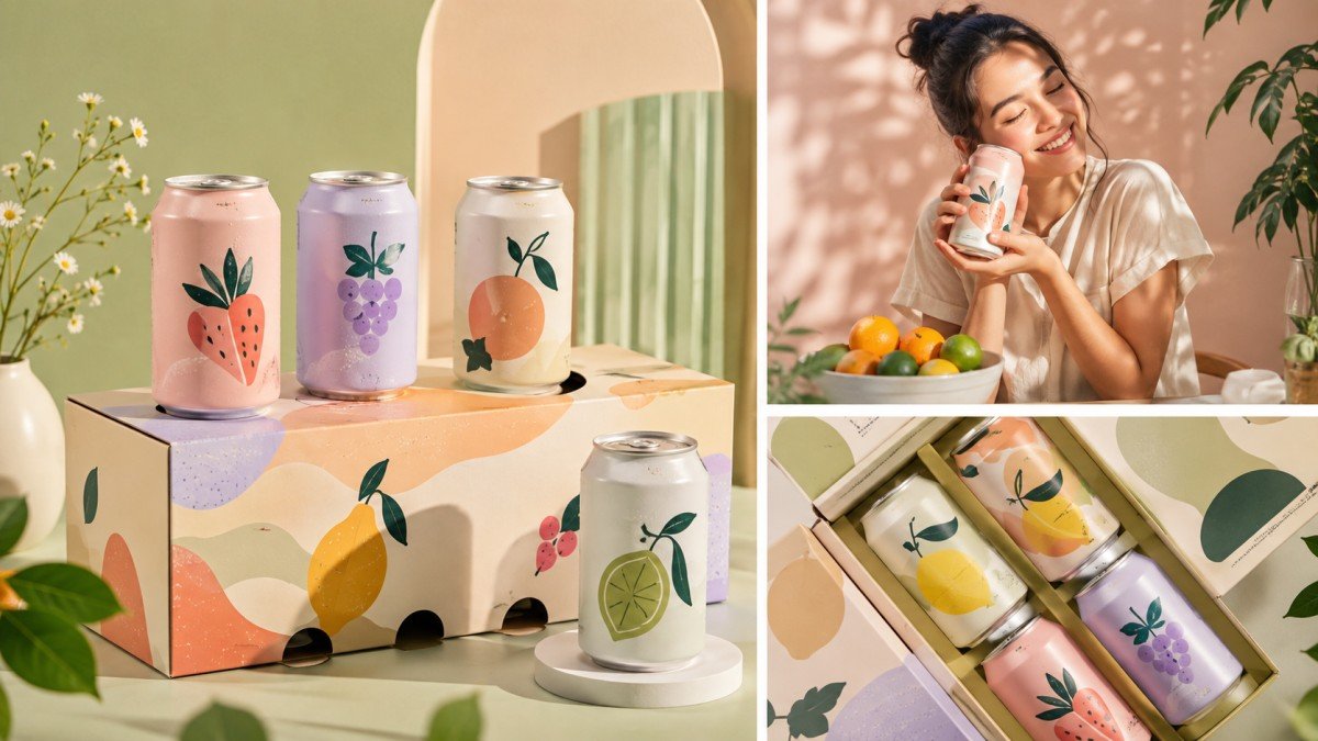
Olipop uses illustration, color, typography, and recurring cues as a system. Pentawards’ Olipop feature shows how dynamic visuals can communicate flavor while adding energy and shelf appeal.
A good packaging system should answer 3 questions fast:
- Is this my brand?
- Which product is this?
- Why should I care?
Lesson #3: Make Color Work Harder
Color shouldn’t be picked because everyone in the meeting “loves blues.” It needs more serious consideration.
Research in Humanities and Social Sciences Communications found that packaging elements such as color, graphics, typography, and layout can shape purchase intention and brand experience.
For your rebrand, create a palette that helps customers distinguish products while keeping the family recognizable.
Lesson #4: Let Typography Do Some Heavy Lifting
I love decorative types as much as the next designer. But if customers need to squint to find the flavor, we have a problem.
Olipop pairs expressive typography with strong visual hierarchy. That gives the packaging personality. Your logo, product name, flavor, and key benefit should have an obvious order.
This is also where a professional logo design service in the Bay Area can help. Your logo needs to behave across packaging, websites, and social content.
Lesson #5: Design For The Shelf, Not The Presentation Deck
Your mockup can look gorgeous on a 27-inch monitor. The supermarket shelf doesn’t care.
Packaging has to survive visual competition, viewing distance, multiple SKUs, and clutter. Research shows that visual and structural packaging elements can affect consumer value perception and purchase intention.
Test your design small. Test in a row. Test it beside competitors. If your brand disappears, go back to the drawing board.
Lesson #6: Connect The Whole Customer Experience
Olipop’s story also shows why packaging can’t operate alone. Better Off Studio’s case study covers strategy, UX/UI, design, Shopify, and development, while stressing alignment with business objectives before pushing pixels.
That’s a lesson more businesses should follow. Your packaging, website, logo, social graphics, and sales materials should feel like they attended the same family reunion.
A full-service creative agency in Santa Clara, like Copa Design, can help with a wider product identity refresh, but start with the business problem before opening Illustrator.
For ongoing creative needs, unlimited graphic design services in Santa Clara, California, can also help keep a growing product line consistent. The goal is consistent design with a clear purpose!
Olipop works because its packaging isn’t decoration stuck onto a can. It’s a brand strategy you can see. For your next rebrand, aim for the same thing—make the product recognizable, ensure the message is clear, and give people a reason to look twice.
FAQs:
What makes Olipop’s packaging design so effective?
Olipop’s packaging works because it combines bold typography, hand-drawn illustrations, flavor cues, and nostalgic visual references. The 2026 refresh builds on familiar brand elements while making flavors, ingredients, and product information easier to understand at a glance.
How do I know if my product packaging needs a rebrand?
Your packaging may need a rebrand if customers struggle to recognize your products, understand key information, or distinguish between different SKUs. It is also worth reviewing when your current design no longer reflects your positioning, audience, product quality, or broader brand identity.
Should packaging design match my logo and brand identity?
Yes. Your packaging should feel like a natural extension of your brand identity. Your logo, colors, typography, illustrations, and messaging should work as one visual system. This creates consistency across packaging, websites, social media, and marketing materials, making your brand easier to recognise. This is where professional support can be beneficial. Full-service creative agencies like Copa Design provide logo design, branding, print, and integrated design services. Its subscription-based Breeze model also offers ongoing support, making it useful for businesses managing multiple branding and marketing projects.