

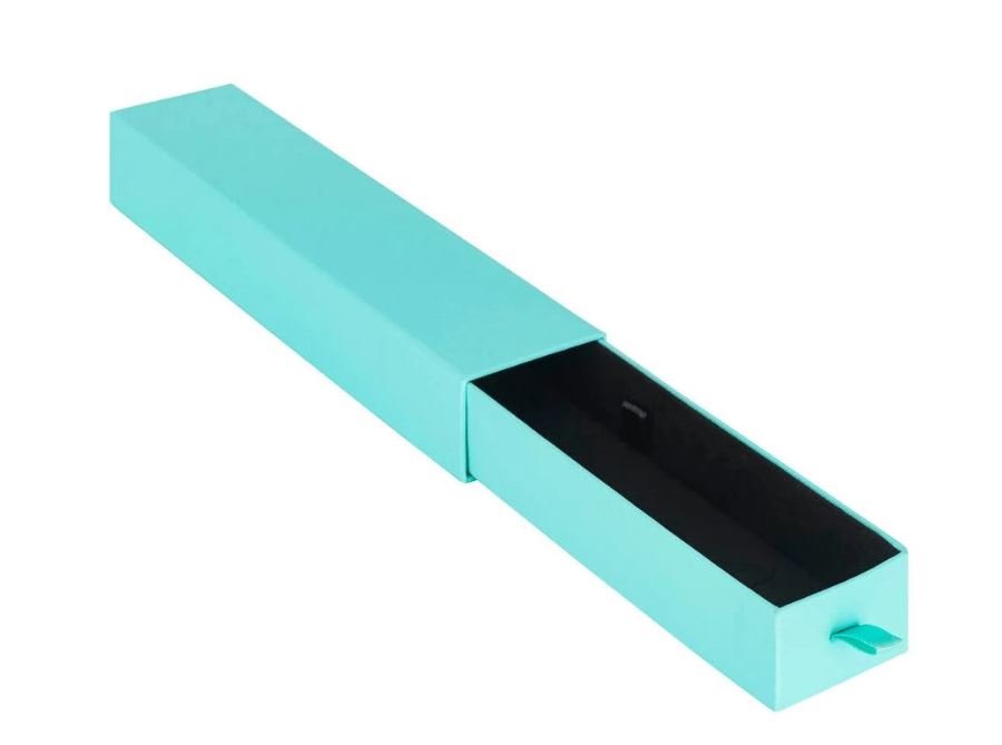
A streamlined collection of bracelets is characterized by minimalism: delicate chains, simple shapes, discreet accents. It’s the same with the design of your packaging. A box that is busy, cluttered, or simply poorly constructed distracts from the jewelry. A plain and sturdy container enhances the piece even before it’s put on the customer’s arm.
Minimalist packaging is not about less work. It’s about fewer decisions and better decisions. The guide below will walk you through creating a box that safeguards your bracelet, promotes your brand, and stays budget-friendly.
What Minimalism Means in Packaging
Minimalist design is based on 3 principles: space, restraint, and efficiency. The empty space on the top and inside of the box allows the eye to relax. Most brands can be represented with 1 logo and 1 to 2 colors, plus one finishing touch. Sharply defined edges, even spacing, and a precise fit are far more indicative of quality than decoration.
The best advice is: Check every item on the box and ask yourself, does it protect the bracelet or does it ensure the brand? If it does neither, then it can probably be removed.
Choosing the Right Box Structure
How the box is constructed influences the way the customer will experience your bracelet before they even have the chance to see it. Drawer boxes, with their sliding trays inside sleeves, are the best fit for more minimalist jewelry pieces. The slow slide-out reveal lends the unveiling a sense of purpose, and the sleeve provides a clear area to showcase your brand or logo.
Magnetic flap boxes shut with a gentle click and are better suited to more expensive items or gift sets. Two-piece lid boxes have a very simple, clean look that is effective for gift sets or for a more classic presentation without a lot of design details. Slim tuck boxes are most affordable and are great for lighter-weight, lower-priced bracelets.
Materials That Feel Considered
In minimalist packaging, texture does the work that graphics do elsewhere. Uncoated or matte paper looks calm and modern and hides fingerprints well. Kraft board suits natural, handmade, or eco-focused brands. Soft-touch lamination adds a velvety feel without adding visual noise, and linen-style paper brings depth while keeping the colors quiet.
Whatever material you choose, make sure the board is thick enough to keep its shape. A drawer that bends when pressed immediately undermines the premium impression. Recycled board is also worth considering, as many jewelry shoppers prioritize sustainability.
Keeping the Palette Quiet
Neutral colors allow the jewelry to be the star. Neutral shades for the background jewelry include off-white, sand, warm grey, and soft black. You can also stick to muted earth tones such as clay, sage, and stone. A monochromatic palette, one color with a variety of textures, can also work.
Gold, Silver, and Rose gold all complement fairly neutral backdrops. To highlight it slightly, limit it to a monochrome foil-stamped logo or an interior colored inlay that is only visible when the drawer opens.
Designing the Inside as Carefully as the Outside
The interior is where a minimalist box earns its value. A bracelet should be displayed, not just stored. Foam or paperboard inserts with a slot hold a chain or bangle firmly in place, while small cushions in linen, velvet, or cotton present the piece at an angle that shows its shape. Fabric-wrapped trays add softness and protect polished metal from scratches.
Delicate chains tangle easily, so lay the bracelet fully extended or in a gentle curve rather than bunched. A thin sheet of tissue or an anti-tarnish layer is a simple extra that helps silver and plated pieces stay bright.
Subtle Details That Finish the Box
Small touches make a minimal box feel complete without adding clutter. A single foil-stamped or embossed logo on the sleeve is often enough. A thumb notch or short ribbon pull on the drawer makes opening easier and feels thoughtful. A brief message printed inside the lid, or a slim card with cleaning tips and a thank-you line, adds a personal note.
The key is to avoid stacking effects. If you use foil, skip the heavy pattern. If you use texture, let it carry the design on its own.
Packaging Options Compared
Different bracelets call for different boxes. This table summarizes how the main options compare.
| Box type | Best for | Look and feel | Relative cost | Protection level |
| Slim tuck box | Every day, low-priced bracelets | Simple and light | Low | Basic |
| Cardboard drawer box | Mid-range collections | Clean, modern reveal | Low to medium | Good |
| Two-piece lid box | Classic or gift styles | Traditional, tidy | Medium | Good |
| Magnetic flap box | Premium and gift sets | Rigid, high-end | Medium to high | Very good |
| Fully rigid drawer box | Fine jewelry | Heavy, luxurious | High | Excellent |
Using one consistent design language across the range, with the same palette, logo placement, and typography, makes the collection look unified even when box types and sizes vary.
Preparing to Ship and Handle
The gorgeous box is not yet in your customer’s hands. Sherpa says more simply designed boxes are often easier to scuff, so protect them. Use a mini mailer or a corrugated carton inside your Ship Drawer box so the sleeve can’t slide open while shipping. Matte and soft-touch finishes are less forgiving than glossy finishes.
A box that is too big lets your product move around and look oversized, so measure the product to find dimensions that are as close as possible. Pack one sample parcel and see how it performs: give it a shake, stack it, and drop it from approximately three feet.
What to Check Before You Order
Preparing can save a lot of money, particularly on custom runs. Begin by purchasing samples and trying them with your actual bracelets. Measure the thickness of the board, and ensure the drawer glides effortlessly without sticking or dropping out. Look for well-finished edges and corners, and ask to see a printed proof so you can compare the color, since neutral colors tend to change in tone from print to print.
If ordering for the holidays or other gifting season, ask for minimum order quantities and lead times. When pricing, don’t just compare unit costs; consider the total cost, including tooling, printing, inserts, and freight. Some suppliers that can implement changes in sizing, inserts, and finishes in a single order make this more feasible. For instance, Custom jewelry brands order samples from Premier Rigid Boxes to compare their drawers with a rigid-box offering.
Common Mistakes to Avoid
The top mistake is overdesigning with additional colors, fonts, or effects, which negates the minimalist effect. Another common mistake is selecting a box that is too large for the bracelet, which allows the piece to move and scratch, as well as skipping the insert, which allows chains to bunch and tangle. Thin board that dents or warps easily, and ordering in bulk before testing the sample can also turn a small mistake into a big one.
Final Thoughts
When a minimalist bracelet box design has something to say, everything should have a reason: a precise form, a considered material, a subtle color, and an unbranded interior that shows off the jewelry. A cardboard drawer bracelet box is a natural choice to complement contemporary collections because it is stylish, safe, and affordable. Stay open to new ideas, and keep your bracelet on show.