

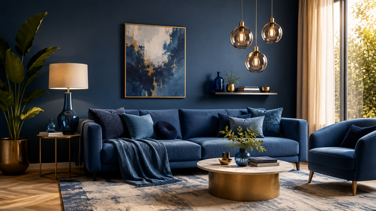
I feel monochromatic interior design is about embracing one predominant colour that brings depth to the room and enhances its uniqueness.
A single colour can have various gradients that go with each other perfectly. A monochromatic interior design idea can make you feel tranquil if the correct colours are used. It is important to maintain the colour contrast in the space to create harmony that is visually pleasing.
Monochromatic Colour Variations and How to Implement Them in Home Decor
A single colour framework in your home interior can automatically elevate the interior aesthetics. Monochromatic interior design tips include the use of multiple shades and tones of the same colour. It focuses on creating the base with a single colour from the colour palette, thus providing an enchanting decor.
Key Design Principles Behind Monochrome
The main principle in monochromatic decorating ideas is unity. When using one colour family, you can experiment with different levels of contrast, texture, and light to keep the room lively. The following are a few other principles to increase your home aesthetic:
Choose One Dominant Color
Sometimes one colour can do wonders. Use one dominant shade to create the overall atmosphere of the room. A single colour can bring out the beauty of your interiors.
Use Different Shades and Tones to Adjust Contrast
Every single colour has its own speciality. Don’t repeat the same colour throughout the entire room in a monochromatic home decor. Use other shades of your choice to avoid monotony and bring about exclusivity. Different shades of the same colour provide a rhythm of contrast that makes a space stand out.
Importance of Depth
In the case of a constrained color palette, texture is a crucial element. The magnitude of the beauty depends solely on the texture. Furniture can be used to make something look interesting even if the colors are the same.
Consider Lighting
Colors can appear different throughout the day depending on the natural and/or artificial lighting. Try out the shades you have selected in the room and see how they look under various lights before the real installation. Remember to consider the function as well.
Monochromatic interior design is a technique that is achieved by incorporating different shades of a monochromatic colour scheme to produce a magical effect in the interiors.
1. Single Hue Green Space
The colour green is related to nature. Calmness prevails with the colour green. A room can have a fresh appearance with various shades of green. For example, dak green walls paired with an olive-colored sofa.
2. Beige Interior
Beige is a light greyish brown colour. Interiors with beige tones are done in cream for a soft and timeless appearance. Example: Cream-colored walls and a carpet complement extremely well with wooden furniture.
3. Gray Monochromatic Interior
Gray is the ideal complement to monochromatic interior design. It is a contemporary and simple way, particularly with the use of lighter or darker shades superimposed. Example: bedroom light gray walls, charcoal bedding, gray furniture, textured curtains.
4. Cream or White Monochromatic Interior
White monochromatic design features sharp white, ivory, cream, and off-white colors. White is a colour of peace that finds its place in a relaxing home decor idea. Example: A minimalist living room with white furniture accompanied by any light colour shade. ,
5. Dark Brown Monochromatic Interior
Browns can add a comfortable essence to the interior. Thus enhancing monochromatic home styling. Example: Brown leather chairs and furniture add elegance to your room.
The table below represents the monochromatic designs as well as what to look at quickly.
| Check | What to Look For |
| Color | One dominant hue |
| Depth | Light + dark tones |
| Texture | At least 2–3 materials |
| Contrast | Subtle visual variation |
| Balance | No single element dominates |
The Pros and cons are as Follows
Colours portray a unified look through the same hue. But if not balanced, it can become repetitive and/or visually bland. The secret is to use different tones and textures of the same colour to maintain continuity.
Pros
Produces a cohesive look
Select your colour according to your room aesthetic. The use of various tones of the same colour contributes to the beautiful look of the furniture, fabrics, and accessories.
Create Structured Spaces
Colours are expressive within themselves. A few colours can make it easier to avoid visual clutter and create a more soothing environment, which is ideal for your house.
Makes Styling Smooth
The design is based on a single colour scheme and allows the use of one colour or gradient in furniture, decor, and accessories, avoiding too many colour options. Different colours mixed can cause visual confusion. As a result, one colour supremacy should be maintained.
Cons
Same Colour Orientation
Colour typically focuses on a single colour, thus making it mundane. A small difference in colour tone can significantly change the mood of a room, making it monotonous. The selection of the last shades should be reviewed in conjunction with the lighting, room dimensions, and materials surrounding the room.
Although there is a good and a bad side of monochromatic colour schemes, the right monochromatic colour scheme will always turn out beautiful irrespective of its vast number of gradients, if incorporated properly. Interior designer Daniel Hopwood points out that a tonal color palette can be used to alter the entire feel of a room – thus, don’t mistake monochromatic for just using the same colors
Final Takeaway
Choose a colour that suits your mood and portrays your nature. Thus, to conclude, with correct colour application, you can implement home decor ideas that will elevate your interior design. If you are interested in home decor and design, feel free to share your tips at home improvement “write for us”.
FAQ
1. How do you make a monochromatic room look interesting?
A monochromatic room looks amazing if the right colour and its gradients are used, including different shades, textures, patterns, and materials. Use proper lighting and accessories to improve home decor patterns.
2. What colors work best for monochromatic interior design?
Monochromatic colours are special on its own. The color options are popular, including blue, green, beige, gray, white, and brown, which provide an aesthetic and can be layered easily.
3. Is monochromatic interior design suitable for small rooms?
Monochromatic colour palettes have a versatile characteristic. It can uplift any room’s appearance. Lighter colors, especially, can make the room more open and inviting.